

In 2012 I met with the owner of Textbookly who was a recent Kent State University college graduate. He created this website out of the frustration of textbook prices. He wanted to give a tool to college students to find the best prices on their textbooks.
He communicated that he wanted a rebrand as his current brand had no particular vision or voice. The rebrand would effect more multiple touch points – website, social media, print ads, and more!
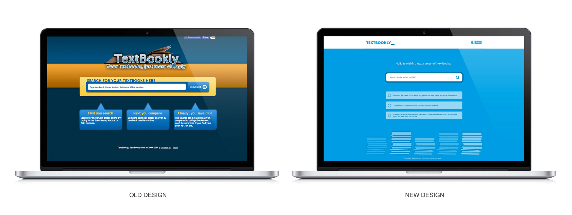
For the website, he wanted to keep the interface simple, he wanted a design that supported fast load times and he wanted to keep the main focus present: searching for textbooks. So, I played up a simple color palette and highlighted the search bar (the most important feature). The actual redesign of the website was also heavily influenced by the popular “flat design” trend at the time.
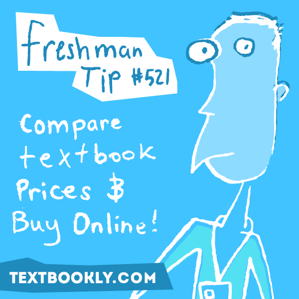
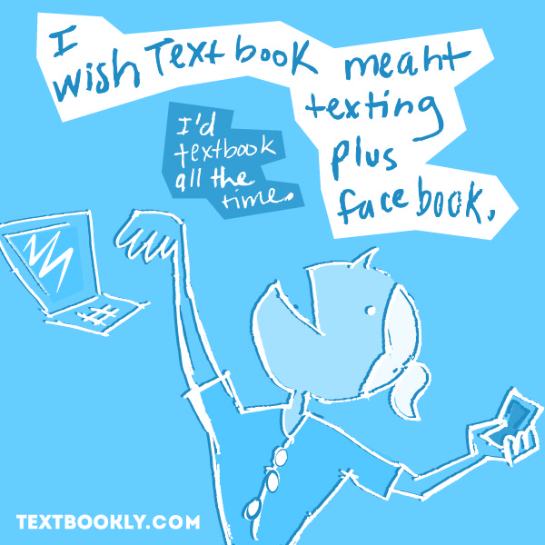
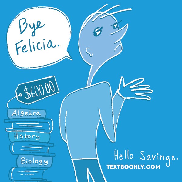
For the rebrand, I wanted to make Textbookly easily recognizable so that when a college student walked down the hall and saw our posters that they’d remember us. That solution started off as a memorable color.
Next, I wanted to come across playful and relatable. The best part was that I was still a college student so I knew all of the inside jokes of the time. So, I had a lot of fun crafting fun and playful messaging that showed up on our website, social media ads, and posters!
The logo redesign reflected the move to simplicity and the blinking cursor played on the fact that Textbookly is a search engine. The logo redesign also made it easier for Pantone print runs using minimal colors and shapes.
ClientTextbooklyServicesBrandingLinktextbookly.com